The challenge
The premium spirits market has long been associated with exclusivity and tradition, often making it intimidating for newcomers. House Pour wanted to break down these barriers by creating an identity that felt playful, modern, and inviting, while still reflecting the craftsmanship and quality of its products. Additionally, sustainability was a key consideration—designing a packaging system that minimized waste without compromising the brand experience was essential.
The solution
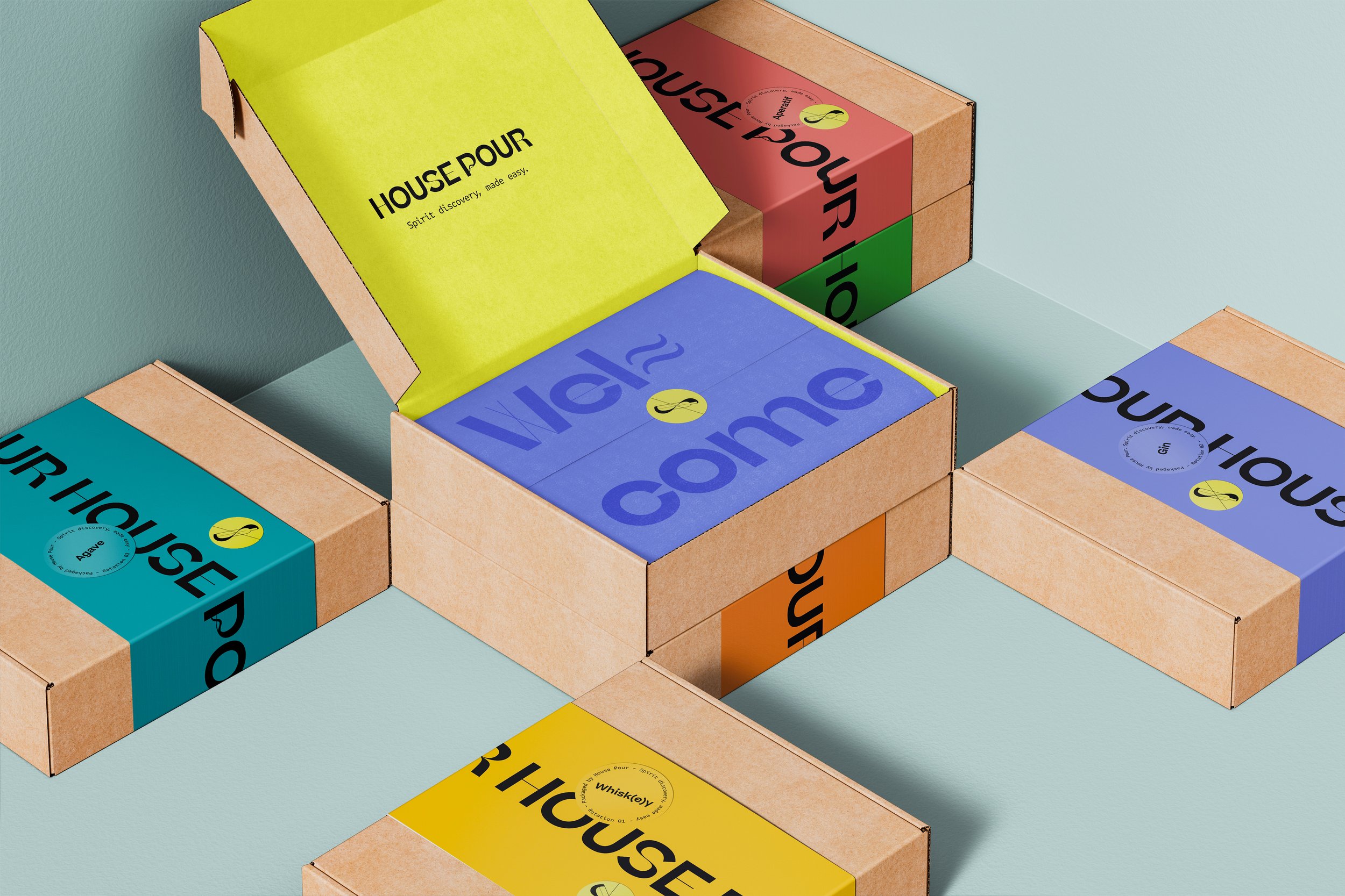
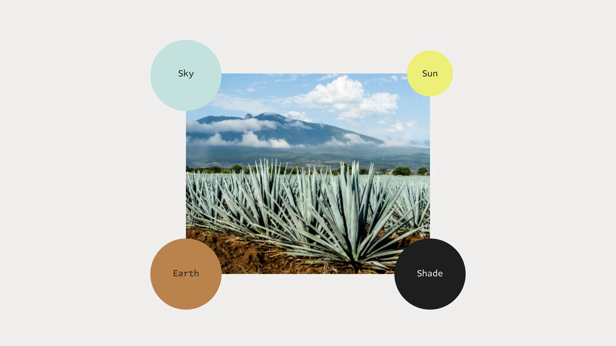
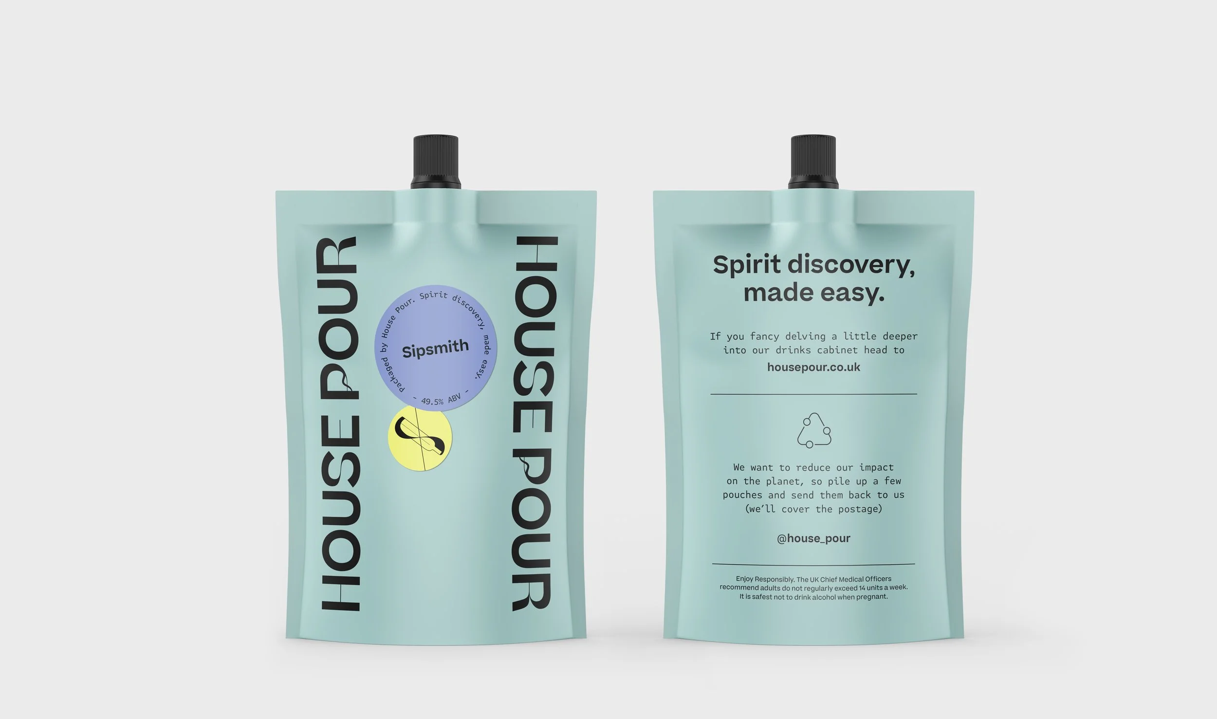
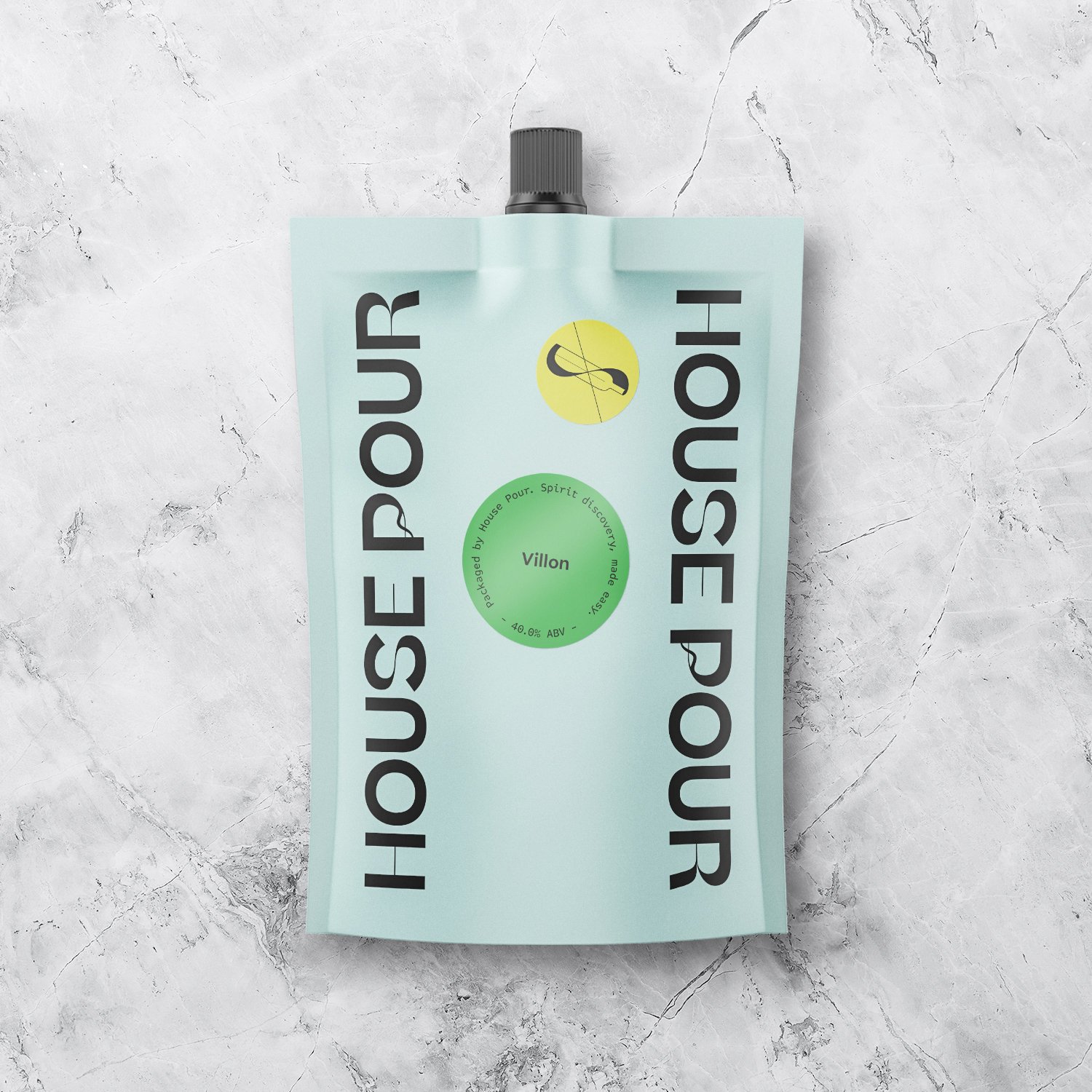
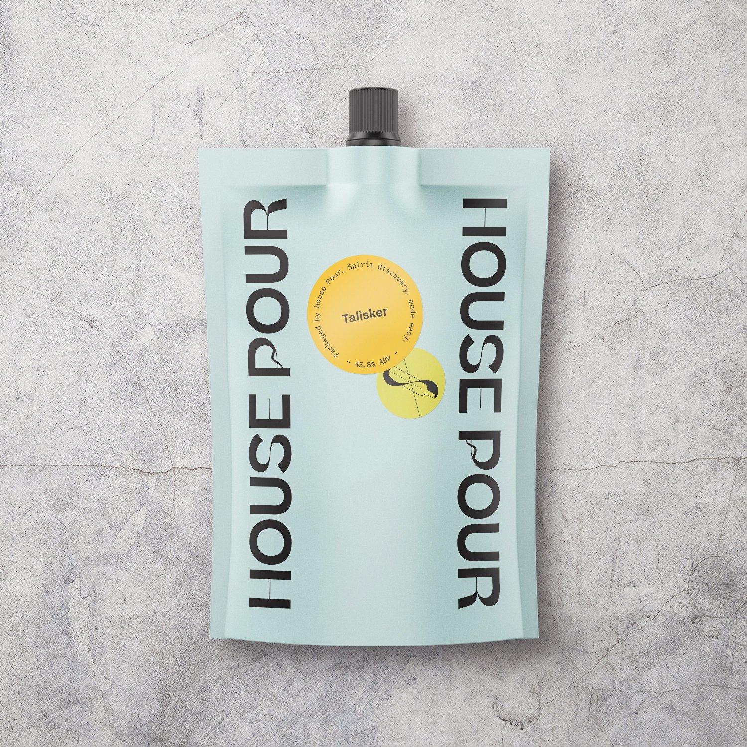
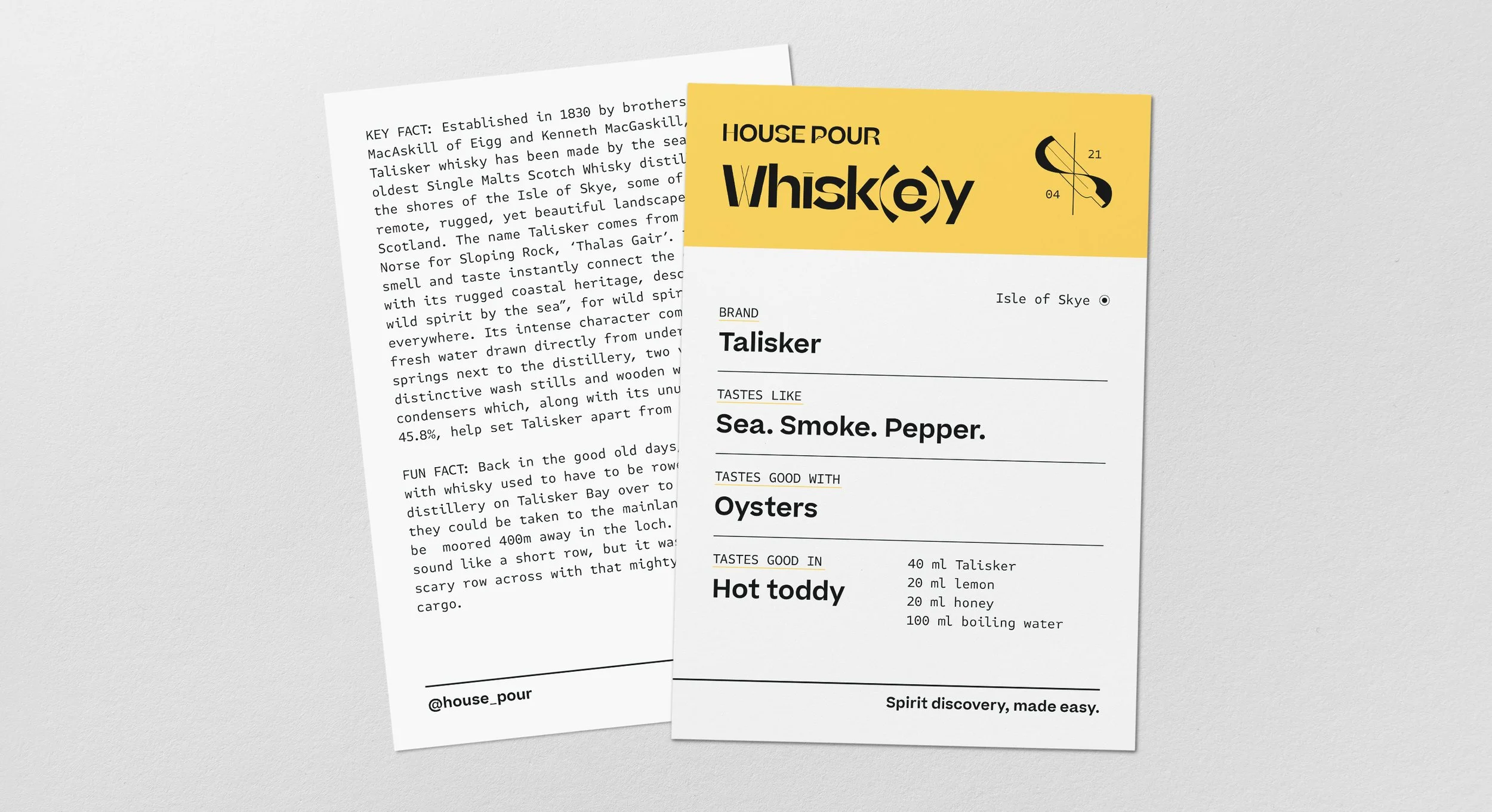
House Pour’s visual identity embraces bold simplicity with a strong focus on discovery and joy. At the heart of the branding is an elegant yet playful icon, constructed on an eight-spoke radial grid, symbolizing exploration—much like a compass guiding consumers through new flavors.
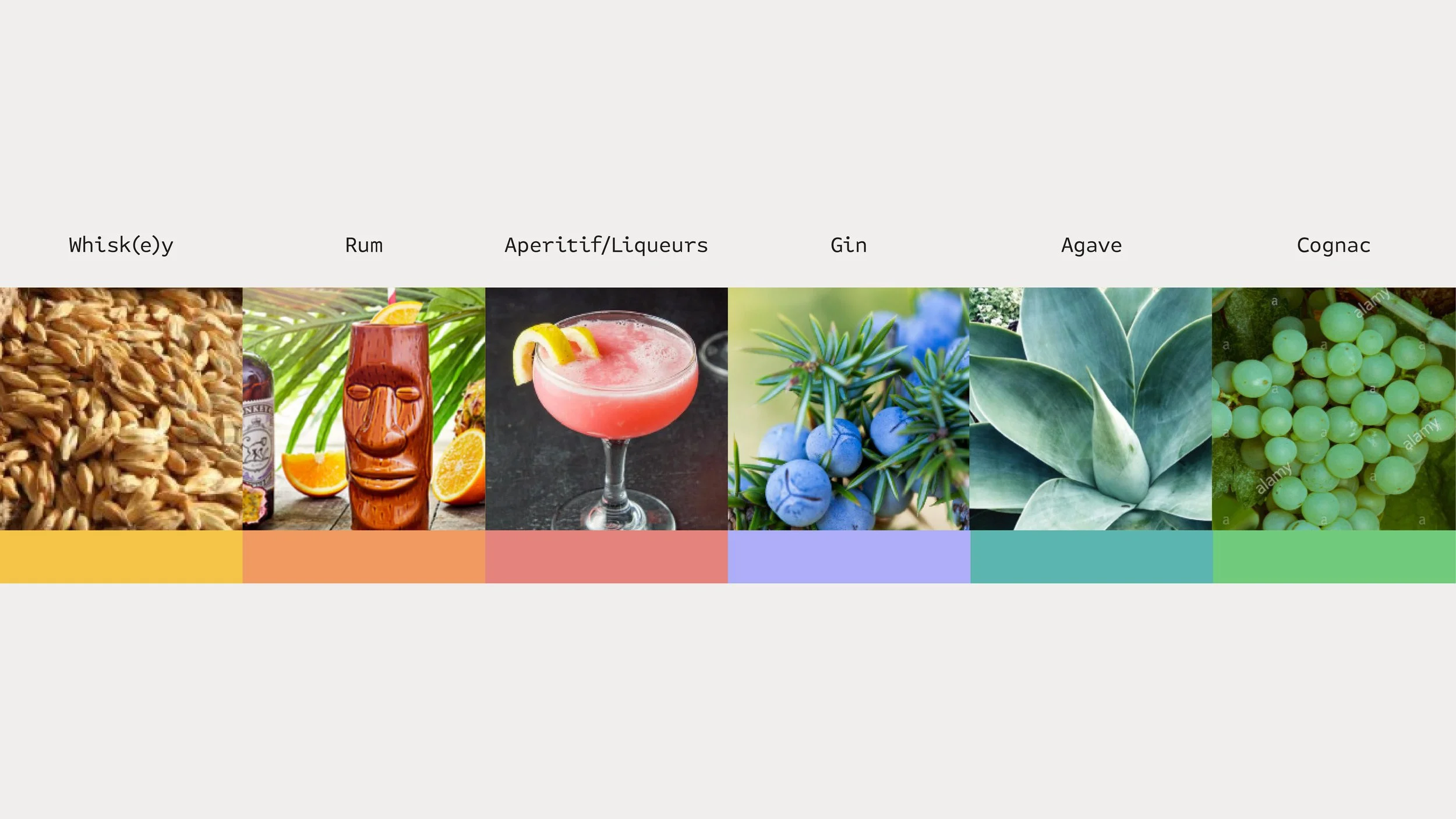
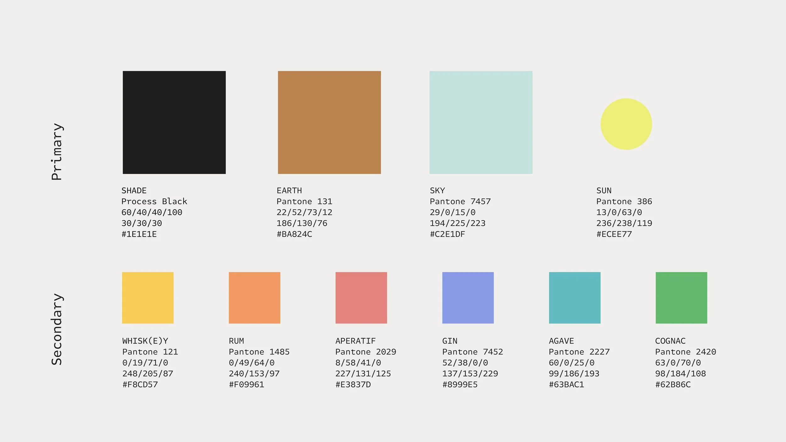
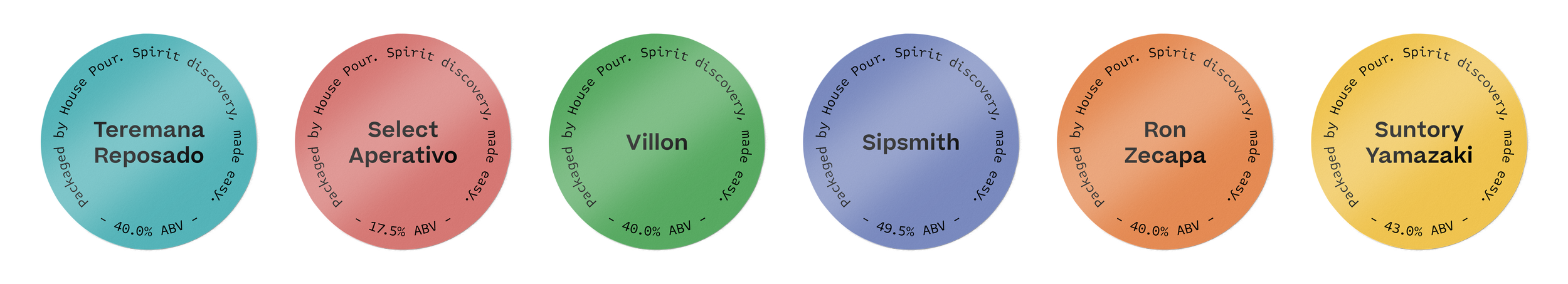
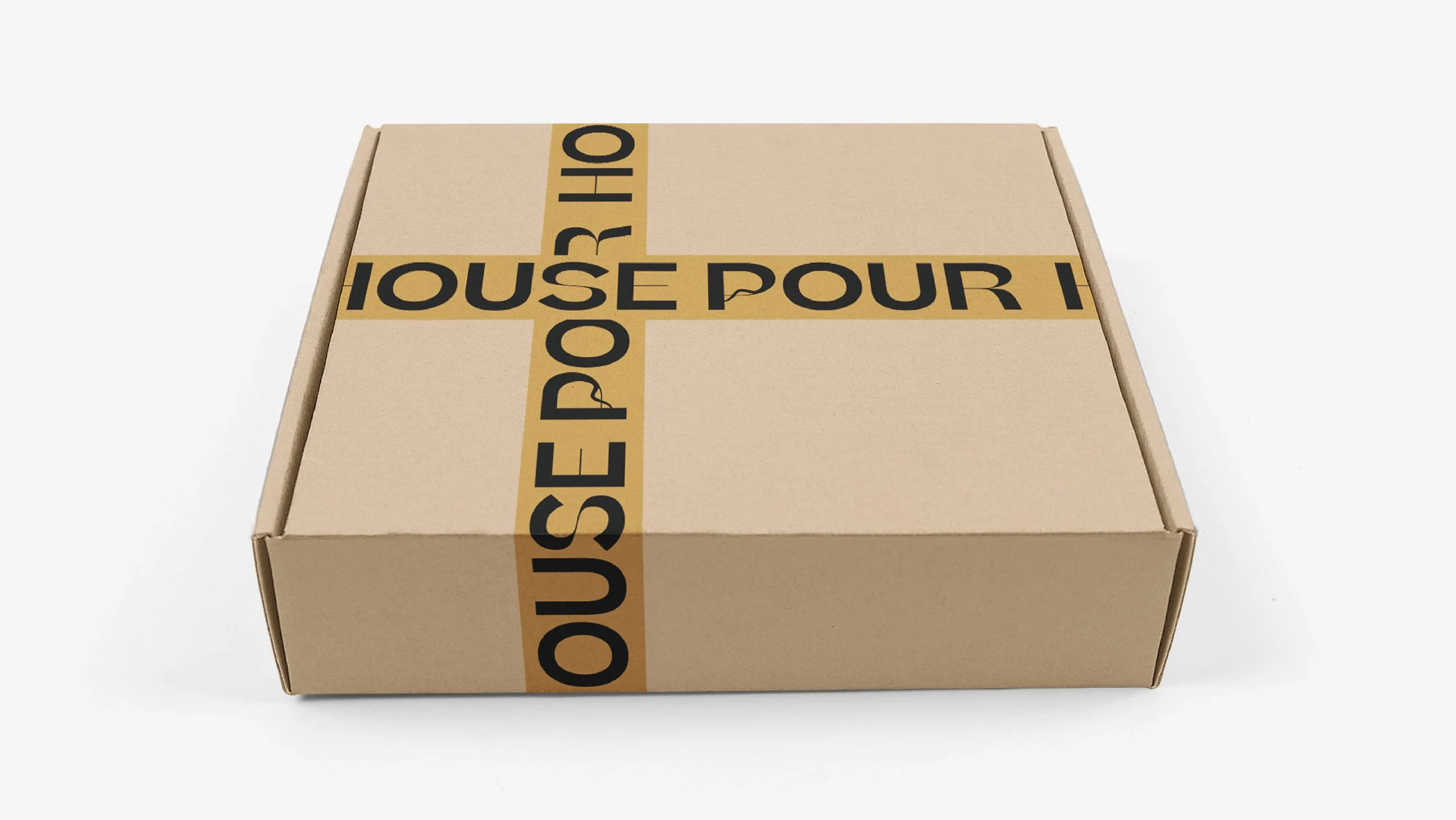
To ensure both consistency and sustainability, House Pour implemented a systematic, color-coded packaging approach. The same pouch and box are used for every delivery, with only the batch sticker and tasting notes changing each time. This innovative system allows customers to return empty pouches, which can be refilled and reused, significantly reducing the brand’s environmental footprint.